Monday, 29 February 2016

No7 Campaigns


Image 1 
The models freckles are showing and her skin looks very plump and clear 
-Her hair is wind swept and slightly messy making her appear casual and effortless
-The use of the same green colour throughout the image instantly stands out, and contrasts nicely agains the models dark brown hair and eyes
-I found it it interesting that there is minimal use of colour on her lips, it makes the whole makeup look very simple and effortless, making colour or being creative easy to do effortlessly 
-The lighting is quite warm and makes the models hair and skin glow 
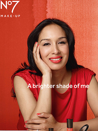


Image 2 
- I think the model is beautiful and radiant and you can see that she is naturally beautiful
-She appears to be wearing a very sheer coverage glowy base as her skin is radiant yet appears hydrated, fresh and plump
-I like that her eyebrows aren't overly groomed and just shaped and set this also makes her appear effortless
-The lighting enhances and highlights the centre of her face making her look even more radiant 
-The use of the same shades of red ties everything together and catches your eye, the use of red in this image really compliments the models skin colour 
-The image symbolises the caption perfectly as the model shines in this image due to the use of colour, lighting and minimal makeup 


Image 3 
- The blue pops/contrasts against the models skin really nicely 
- The woman appears very confident and powerful in this image due to her facial expression and body  language in this image yet elegant at the same time 
- I feel she symbolises the ideal elegant independent business woman with inner beauty pouring within 
-The pose the model is in compliments the caption well 
-Her skin looks radiant due to the lighting used 


Image 4 
- The model in this image is wearing either a suit or blazer in this image and looks quite professional, this is also communicated through the caption 'You will take these red lips seriously' this could symbolise that her confidence to wear red lipstick is making her feel more confident and beautiful and it also seems that their could be an element of mocking sexism in regards to the caption 
-Her hair is unique and stands out a lot against the red colour theme and also her black blazer 
-This woman appears to be a more mature age than the other models in the images above, yet she looks radiant, youthful and beautiful


References 
http://i.dailymail.co.uk/i/pix/2015/08/05/10/2B1D28D800000578-3185794-image-a-7_1438766989494.jpg
http://cosmouk.cdnds.net/cm/14/30/53d4c386e68fb_-_070813-yasmin-boots-no7-dn6y9s-lgn.jpg
http://imworld.aufeminin.com/story/20130808/no7-say-no-to-airbrushing-for-new-beauty-campaign-58292_w1000.jpg
https://s-media-cache-ak0.pinimg.com/564x/6d/4c/7e/6d4c7e159ac8cf956bb16c372f28b975.jpg

Studio session with Mel and Becky


In my most recent studio session for Digital image, me and my peer Becky, brought in our friend Mel, so that she could be our model whilst we practiced shoots for our brands.I had done some planning before hand the shoot and decided that I wanted to re create some images similar to No7's beauty ads, No7 are very much about featuring natural 'real' women and the ads can look quite exaggerated and little cheesy. To re create my own No7 inspired images during the shoot I encouraged my model to smile, laugh and feel comfortable as I feel that No7 ads present their cosmetics by featuring models wearing their cosmetics, yet it is more about capturing images that make women feel beautiful and comfortable in the skin their in. 

The image below is an example of a No7 beauty ad, this ad is just one of the images I looked at when finding a better idea of the mood I will need to create for my final image for my word. I feel that I can I be quite experimental when considering the lighting, my word and also the No7 theme in their beauty ads, altogether they can create either a really sexy, demure mood to my images or a really rebellious, moody theme. 

No 7 Ad
Google Sourced Image.
http://i.dailymail.co.uk/i/pix/2013/08/07/article-2386405-1B2BF5DA000005DC-767_296x317.jpg

The above image features a real woman as No7's model for this beauty ad, I like that they used a real woman and I think she looks stunning in this image. There is a caption saying 'Im sparkling' over the model, which perfectly suits the mood and vibe she gives off in the image, her eyes and skin look bright and sparkly, correctly reflecting the caption.


Chris suggested that the next time I practice some images, to try and change the lighting I am using and instead of placing the the light directly at my model I should place it just above her head so that the light falls subtly and the picture becomes much more grunge and moody. This lighting is something I want practice for my editorial shoot. 


The images above are my favourite photographs I captured during this session, I was really happy with the outcome of these images and think it has a similar theme to No7 beauty ads. I chose to use purple as my background colour as in No7 ads they tend to use a variety of different shades of the colour worn on the lips. I did the same, using purple lipstick and a purple backdrop, I think this made the images look more grunge and moody as her hair and jumper are also dark. I chose to use the three light set up when taking my images, with the lighting set at 5 and a half I think, I used the 85L which helped me capture my beauty shots up close. I think the lighting I chose suited my brand also as It was soft enough to make her skin appear glowy and not airbrushed, but still natural and 'real' as they like to promote through their products etc pores, moles, skin tags.


Sunday, 21 February 2016

Studio Session with Chris


In todays studio session Chris demonstrated and encouraged us to experiment and practice using a 'Gobo' set up where you can capture really close up precise beauty shots. I found the set up and process and confusing, but loved the outcome of the images. I want to practice this set up myself in my booked studio session next week.


Chris's studio session Notes

- Light effects > gobo and spotlight 
- Can use honey comb light
make sure cell is switched on 
extra light for effects 

- Research adverbs/ brands that use lighting effects e.g. tree - shadow 
-Spotlight - good for making shadows, can use with gobo slides or without for a sharp perfect circle light

set up - gobo light on boom in front of the model, and honey comb light behind the model to light up the image even more.
Using new camera, same lenses
use ladder and hands to block light

Put the picture into context by playing with the lighting
using hands to block part of the light 
you can focus on part of the face etc eyes, lips 

Change and set up 
- large soft box attached to boom, with black poly boards either side, creating a box for the model, this is good for Gothic Horror , Tony and Guy

Can use a diffuser to achieve softer light 
face soft box away from model but use reflector to reflect the light onto the face. 

My three most inspiring images so far.


Below are my three most inspiring images I have collected since researching and developing my ideas for the word Macabre. I have chosen this images in consideration of my brand, word, colouring, make up and hair design, symbolism, theme and the photography/poses etc. The three images all come from three different sources and have all individually inspired me to create various ideas in response to my word. I have made different ideas yet they all link back and symbolise Macabre in different forms. 

Image 1. 

This image is of my old art work I created on a previous art course, I speak more in depth about the inspiration and meaning behind this artwork in my 'Hidden Beauty' blog where I discuss a interesting article about microscopic photograph and diseases. I find this image inspiring because it has lead me to create and practice make-up designs which create a contrasting juxtaposition between death, disease, pain and darkness with beauty, life and perfection. This image is a great example of how something in real life can appear beautiful or normal without knowing that it is disturbing or 'macabre', it portrays 'Hidden beauty' and 'Hidden Evil' in one image together and I found this image most inspiring when thinking of ways to make a non literal portray of my word.
My 'Sexual Power' artwork.

Image 2.

This is my second inspiring image I found whilst in a Digital Image lecture with Sharon, in this lecture Sharon had brought in various 'Beauty Magazine' and 'Fetish' magazines which she encouraged us to read through and seek inspiration, which I did. This particualr image stood out to me because of the rich, dark 'red/burgundy' shade spread across the models lips and face. The whole image just stands out and makes you think, I love the contrasting expressions the model is making as well, In one picture she looks laid-back and as if she is having fun, playing and feeling the product on her skin and just spontaneously doing something in the moment of being photographed where as the second image is much more posed and serious. This image reminded me a lot of the theme I want to create (2nd image) and what image my brand would create (1st image) for the word Macabre. I want to take some of the inspiration and apply it to my practice shoot next week in my booked studio so that I can create a more fun and less serious portrayal of Macabre make-up and mood. 


Image 3. 

My last inspiring image is a screenshot of some eye-make-up I discovered on Instagram. I found this image on Illamasqua's Instagram page and fell in love as soon as i saw it. The overall image is so detailed, simple and unique altogether and I have not seen make-up like this anywhere, which is why it stood out to me so much. The coloration used in this make-up reminded me instantly of a bruise or bruising around the eye with broken blood vessels, the eye looks so sensitive and fragile but also full of colour and life at the same time. Everything about this image is interesting and most importantly it makes you think and starts a story, selling you not only the look but the background behind it. It is a very artistic make-up look and also reminds me a lot of mosaic and marble like patterns and textures. This is another reason why It is inspiring for me, It makes me think of textures, colours and patterns in response to the coloration used in the make-up look, you could analyse it and think for hours.


The No7 Trial.


Alongside planning and blogging about my ideas for my final photoshoot, I have decided to complete a short trial where I will trial and test out different No7 products for a week. I am doing this so that I have a better understanding of the products that my brand 'No7' promotes and sells as part of their campaign and individually, this trial will allow me to see if I have my own 'Tah Dah' moment myself due to No7 and also give myself a better idea of the colour pay off, consistency and performance of these products and how I can adapt this to my final make-up design. 

I have decided to test skincare and cosmetic products as they are both equally as important when maintaining and enhancing your beauty, plus No7 promotes both categories of products in their campaigns and also in stores. Luckily, due to my mother working at Boots as a manager, I worked my charm and persuaded her to purchase me a few products that the No7 team at her Boots store recommend and enjoy the most. These are the products I will trial as they are the products I would use due to what No7 thinks will be most beneficial for me as a customer, this is an important factor to consider as we are using the same marketing technique as our brand by promoting 'their' products on our model so that customers aspire to try and buy these products so that they can achieve the same beauty advertised in our final images. Also some No7 advertisements have been banned in the past due to false advertisement in regards of their beauty ads and the products used, this is also something I wanted to explore further as honest colour pay off and performance of these products will not only tell me if my final look would actually be possible to achieve through the use of No7 products and also If No7 cosmetics deliberately have a certain colour pay off and finish due to their customer audience and age as not everyone wants to experiment and wear pigmented, bold colour. 


When beginning this trial, I visited my Local Boots store and purchased some products as well as receiving skincare and cosmetic products and mini samples from my mum. In regards of the prices of the skincare and cosmetic range No7 sell,I don't feel the prices are too bad and are quite affordable, there were only a few products I was hesitant to purchase from the skincare range as I wasn't too sure if the product was worth the asking price. For example on the official Boots website the skincare category is captioned with the title 'Perfect Skincare for every age', and then there are numerous links on the side separating skincare products for different age ranges. Some of their face creams for my age group '20-35 year olds' have starting prices of £19.00, I was very surprised at this as I would consider skincare brands which having beginning asking prices of that much to be a luxury skincare brand such as 'Clinique'. 

Annoyingly, I did not trial any skincare products from this range which would have been ideal as it caters for my skin type and age group, but I still tested their other skincare products from the 'Protect and Perfect Intense' range.

Protect and Perfect Intense Advanced Skincare Range
Instant Illusions Airbrush Away Primer
Youthful Eye Serum.

I tested the Protect and Intense Day cream and hand cream daily for one week, and then the other two products every other day. My first impressions of the day cream was that I liked the simplistic packaging, similar to simple, clean fresh colour palette Clinique uses in their skincare packaging. I chose to try the day cream from this range also because of the use of spf in their products which is something I look for in skincare products as a customer, its a deal breaker for me as I have irregular pigmentation and melanin in my skin due to being black.

I really enjoy the scent, packaging, finish and feeling of the day cream, it leaves a dewy/ glow finish to the skin and doesn't take long to dry and absorb into the skin. I wasn't impressed with the products performance as once it had absorbed into the skin I didn't feel as If I had any face cream on anymore and my skin began to feel dry and a little de hydrated. Because of this, I began to apply more on a daily basis and sometimes even add the 'instant Illusions' primer with the day cream so that I could apply both products at once testing if it made any difference to how my skin felt, which it didn't. I felt disappointed by the day cream and primer as I felt both products did not have an amazing performance or difference compared to the skincare products I normally use.  I began to try the eye serum in the evenings, when I would normally remove my makeup and cleanse my skin. I was most excited to try this eye serum as eye products are a favourite of mine and they make a real difference in the morning, especially when I have a 9am lecture.

The eye serum has a very light/ fresh scent similar to the day creams fragrance, again it has very simple professional packaging which is nice and it dries and absorbs into the skin quickly. Compared to the day cream,it has a matte finish on the skin and has a much more dry texture finish where as the day cream was slightly tacky on the skin once dry. I liked the eye serum, and feel that It made a difference to my under eyes and also made my under eye area feel fresh and plump in the mornings.

The 'Instant Illusions' airbrush primer was most disappointing, I consider myself to be a primer hoarder and I am always searching for the next best primer, but this primer did nothing for my skin. Initially I loved the feeling of the primer, compared to silicone based primers I have used such as the 'Smash box photo finish primer' this No7 primer felt almost like moisturiser, which was refreshing and hydrating on the skin and felt lovely. Although, the matte finish it first creates when applied to the skin, disappear quickly and begins to merge into the day cream you are wearing. I didn't enjoy this product at all and found its performance terrible, especially when I wore it under my foundation and concealer also, although I have oily to combination skin so this may effect the performance of the primer, as I may be better suited for a extreme matte finish although I love a dewy finish.

The last product I used was the 'Protect and Perfect Intense Day hand cream', like the other products it has nice, simplistic, professional packaging, a fresh, subtle fragrance and a moisturising finish when absorbed into the skin. Although, I felt that this hand cream didn't moisturise or protect my skin at all, apart from the SPF in the hand cream, my hands felt normal/dry within 10 mins after applying the product as if I hadn't applied the product, and my hands aren't normally dry at all. I don't think this product did anything beneficial for my skin and I ended up hardly using it, it felt too similar to a cheap body lotion that disappeared and just dyed the skin.


'Stay perfect - Eye Pencil, Smoothing eye shadow, pressed eye shadows'
Amazing eye Pencil- brown'


I was very impressed by No7's eye pencils and shadows and will carry on using and purchasing these products. The Eye pencils and cream shadow (nude tube), had amazing colour pay off and pigment and lasted all day which I found surprising. The pencils are creamy in application and have a long lasting performance, I think I only had to reapply liner throughout the day once during the week and I wore the liner from 9 till 1 in the morning. The liners are great and compared to other brands I have tried such as Maybelline which also sell amazing kohl pencils, No7 lasted much longer and maintained colour and finish all day long. The pressed shadows weren't too bad, No7 have a beautiful range of different available colours, but I decided to try and shimmery purple shade and also a nude neutral shade as I could then experiment with the colours for my Macabre make-up. The shadows aren't very pigmented and I had to apply the show at least three times so that It was opaque enough on the lid. The neutral shade was also okay but I had to apply the same amount to the lid which was annoying, the textures of the shadows are very powdery which I didn't like as my more expensive shadows from palettes such as 'Naked 2 by Urban decay' has very buttery, pigmented, soft and easy to bend shadows. The No7 shadows lasted all day without creasing which also surprised and impressed me, I just wish they would improve the texture and formula so that the pigment was a lot stronger. Although, I wonder if they have deliberately created the shadows with this formula so that women can apply as much as they want when experimenting with colours. On the official Boots website, their is a campaign for No7 entitled 'Colour your way', where No7 encourage all women of all ages to experiment and play with colour 'your way' so maybe the muted finish of some of their products is deliberate so that women can intensify a look by adding more or less of a product. This way No7 can cater to all of their audience instead, making their cosmetics almost multi purpose in order to suit all their customers needs.

 4 applications of
No7 Purple eyeshadow
compared to 2 shades of YDK from
Urban Decay Naked 2 palette.
4 applications of
No7 Purple eyeshadow
compared to 2 shades of YDK from
Urban Decay Naked 2 palette.


Moving on to the lip products from the No7 range, these cosmetics didn't impress me much at all, all the colours did not have a fully opaque finish or application which I didn't like as I prefer very pigmented coloured lip products even if they are nude shades. Although, as i reflected on this I began to wonder again if this formula used in the lip products is deliberate so women can have more control over the amount of colour application. I tried out the 3 different lip products within three days of the week trial and didn't want to retry any of the products. I didn't like the finish or texture of the lip products or the colour pay off in the lip shades either. I like the different packaging and also the different range of sizing and product amounts as they have perfect travel sized products as well as long lasting cosmetic sizes. The 'BB Lips' product, did not suit my skin tone at all, it was very sticky/tacky in texture and finish, it had a tacky, gloopy glossy finish which I would end up accidentally smudging or eating throughout the day. The 'High shine lip crayon' is a very pretty shade, but again did not suit me, the crayon texture was soft and balmy which is great if your looking for a lot of moisture in a lip product although I think I would consider it more of a lip tint as the finish of the colour was opaque at all, the product lasted all day but I had to re apply a lot as the colour kept disappearing. Finally the 'Shine and tint' in the shade red, was the best product out of the three, I don't think the shade of red suited my skin tone but it was still a pretty vibrant red, it has a very cosmetic/chemical scent to the product which i did not enjoy and it felt very wet on the lips and took a while to set/finish on the lips. The colour pay off was okay, and definitely tinted all day although  you had to apply at  least two coats of the colour so that It did not look watery. 

Three No7 Lip products above
'BB lips'
'High Shine Lip Crayon'
'Shine and Tint'

The above image are swatches of the lip and eye products are tried.

Since trialling the No7 eye products I am now obsessed with their 'Stay perfect Smoothing eye shadow' in the shade bronze and also their 'Lash Impact' mascara in black. Both products have lovely packaging and I have found myself using them daily and always loving the finishes of both products.

My two Favourite No7 products which I am now obsessed with.


Finally, I am going to review the 'Beautiful skin Hot Cloth Cleanser' and also the 'Beautiful Skin Eye- Makeup Remover'. I found both of these products had a outstanding performance and effect to my skin, I have used both skincare products daily and still do ever since testing them out. The hot cloth cleanser is something I have begun to use every evening after cleansing, exfoliating my skin, I will usually cleanse my skin first then apply the hot cloth cleanser to my dry skin, massaging it in which is lovely as it acts as a mini facial and then I gently remove the cleanser with the muslin cloth and tone my skin afterwards. Using this cleanser has made my skin a lot softer and even and helps calm m skin down especially If I have extracted blackheads from my skin before hand. The Beautiful skin eye make-up remover, is also something I have really enjoyed using, my favourite make-up remover is by Lancome, so I was a little skeptical to try this remover and try it on really heavy eye makeup, but I was very very wrong. The No7 remover, can easily remove anything and only struggles to remove excessive amounts of mascara, other than that It works quite well and has an oily consistency to the product which helps keep your skin feel moisturised instead of dry. As other removers such as the 'Garnier Micellar water' has stripped my skins natural oils away in the past, making my skin feel dry and tight.

Overall, I was really impressed with the trial of testing No7 products, and I feel it really helped me understand my brand and advertisement aims better. No7 have some really amazing products and some really bad ones, which is a lot like every brand honestly. I feel that they attempt to make their brand seem more luxury and on the same level of other lifestyle cosmetic and skincare brands such as Chanel, but of course don't compare. I like the diversity and multipurpose benefits No7 cosmetics have and the control you have as a customer as their products cater for all women, they just need to improve their formula in some areas. One of their campaign titles are 'Colour your way', and as a tester of their products I couldn't agree more, their skincare and cosmetics do cater for all ranges but the formula and advertising to different ages could be improved.

As much as they claim to target all ages and all women, I couldn't help but subconsciously feel as If I shouldn't have been using or wearing certain cosmetics during my trial as I had this constant thought of 'older/mature' women in their adverts trying to experiment, and then I began to feel older and slightly put off the products which of course sounds ridiculous, but its due to the use of older women, mums, grandmas, business women etc in their advertisements. I initially felt quite negative when I was assigned No7 as my brand , but since testing and researching the brand more I don't mind it and feel that I will be consumer of a few of their products in the future.

No7 Colour your way campaign.
http://images.reallyree.com/wp-content/uploads/2015/08/no7-colour-your-way-campaign-2.jpg


Practicing make-up designs.


I recently took some time out from blogging, to practice some make-up designs I had created outside of studio sessions, I practiced again with my peer Beccy who was an excellent model. The make-up designs I re created were inspired by the Macabre 'Hidden Beauty' article I had found whilst researching and the microscopic artwork I had also previously done. I wanted to create make-up designs that symbolised the perfect juxtaposition between Death and Beauty and how something aesthetically pleasing and beautiful holds a evil and deadly meaning. 

I was going to initially create two complete looks with finished base, eyes and lips but I decided instead to do a different eye looks, on either eye with a clean base, as, the main focus of my designs were the dramatic eye make-up.

 I first began to create my first design (images below) I wanted to create a really glamorous smokey eye with hints of red and burgundy. I was very happy with the outcome of this eye look, and wish that the quality of the image was better as the colours I used were a lot more brighter in person, because of this I am going to make sure I apply enough product for my final make-up images so that the texture and colour doesn't wash out under camera. I started the first eye design by prepping the eye with foundation and setting powder and then patting on a neutral shade from my Ben Nye palette to create my base. After prepping the eye lid, I began mixing a shimmery nude shade and matte light pink shade together to create a 'transition shade' which would help separate and blend all the darker colours I add on later. After I applied my transition shade, I applied a shimmery silver colour to the brow bone so that the look was more dramatic and pretty, I created the brow bone shimmer by using one pressed shadow from the Kryolan 'Glamour essence' palette and mixing it with the shade 'Verve' from my naked 2 eye shadow palette. Finishing the look I began adding a dark burgundy shade mixed with a black shadow to the outer corner and crease of the eye, creating a smokey effect. As I began to apply the darker shades I also applied a little more transition shade that I used in the beginning to really make the contrasting colours pop. To finish of the eye and also add more drama and effect I used a beautiful bright pink/red eyeshadow shade from the Kryolan V brights palette and applied the shade to the inner corner of the eye and also smoked out on the lower lash line. To finish the eyes I added some Black mascara and perfected the under eye area of skin.

The second eye look I created focused more on using black shadows on the whole of the eye and making a really defined ,thick feline flick shape with hints of red and burgundy, I felt this eye look was very similar to my first design but the placement of colours were completely different. Again, I was happy with the final outcome of this eye make-up but preferred the first eye look I created as it featured more colour. To create this eye look I first began to prep the eye with foundation, setting powder and then a neutral shadow colour so that I had a base for the smokey eye. I began using nude/neutral shades with a subtle shimmer, focusing these shades mainly on the middle and inner corner of the lid and then began to gradually add and blend in a dramatic matte black shade to the outer corner and crease of the eye, this created a dramatic contrasted effect to the lid, making the black really stand out. After I completed the lid I added a red shade from the Kryolan V brights palette and smoked it out on the lower lash line and also applied some of the same shade to the top lash line just to tie the different shades together. I finished to look with black mascara and again cleaned up and refreshed the skin under the eye area. 


I feel like I prefer the first eye look I created much more than the second look, as part of my next steps I plan to recreate the first eye look again but using a third colour on the eye look instead of just two. I plan to experiment with the colours red, blue and purple with hints of silver and and then also change the defined outer eye shape I originally created making it more smokey and rounded at the outer eye area.


Products Used- (For both eyes)
 Kryolan foundation palette 
Translucent powder
Maybelline concealer 
Kryolan V Brights eyeshadow Palette 
Rimmel mascara 
Ben Nye pressed colour palette 
Kryolan Glamour Essence Palette
Naked 2 Palette
All Makeup brushes


I feel that is look Is ideal for my word and brand as it symbolises my word well, but is also a wearable make-up look for during the day and the evening, I feel that when I smoke out the eye even more making it softer and more rounded at the edges (Similar to Avant Garde), It will appear more dramatic and intensify the look making it more suitable for editorial images similar to make-up created for high fashion photography shoots.


First eye design.


First eye design.


First eye design 
Second eye design.

Second eye design.


Kryolan Glamour Glow
'Pale Tan'
Kryolan V Brights Palette
'Red'


Urban Decay Naked 2 Palette
'Suspect'
Urban Decay Naked 2 Palette
'Verve'


Ben Nye Pressed colour Palette
'Brown Berry, EggPlant, Black'


Saturday, 20 February 2016

Hair Charts and Makeup Ideas.


Since creating my story board for Digital Image, I felt inspired to begin thinking more in depth about the make-up and hair designs I want to execute onto my model. I want to give myself enough time to trial and error some of my ideas, although I feel fairly happy with my chosen hair design, I now just need to make sure it ties in with the rest of the look I want create. 

I want the hair to be very sleek, smooth, shiny with almost a wet like finish to the hair, ideally I would like to have hair long in length; this is another factor I shall have to consider when finding the ideal model for my shoot. I feel this hairstyle will be beneficial for me in regards of time and my hair skills, If I create the look immaculately I feel it will compliment the makeup design I plan to create and will add more drama to the overall images. Below are two hair charts, there are two as I had two hair ideas in mind so that I can adapt my look if something isn't possible to create anymore.The first hair chart is what I aim to recreate for my final images and the second chart is for back up although I may lean more towards this design after practicing. 

The sleek hairstyle was heavily inspired by an image of Kim Kardashian I found last week whilst researching, I loved how effortless the hair was but still complimented her whole appearance in the image, it was very simplistic. When looking at my Macabre hair and make-up designs as a whole I consider myself to be re creating a modern day, sexy, confident, upgraded Morticia Addams. 


http://images.express.co.uk/img/dynamic/79/590x/secondary/3352.jpg


http://www.kioupedir.com/assets/fullimage/kim-kardashian-without-hair-p17hiiv5jri2bh2a.jpg


sleek hairstyle.


Messy bun hairstyle.


In regards of my makeup designs I am currently most inspired to create a smokey eye with matte textures and a matte finish, with a vibrant or muted colours. As a whole I want my make-up design to be monochromatic in regards of the colours I plan to use, I feel the focus will mainly be on the dramatic eye make-up I want to create so that It stands out a lot in my final images, although I may play with bold lipstick colours also. I feel that I can be quite experimental and free with colour when practicing my design, as my brand No7 usually encourage their customers and mature women to express themselves more with colour and different textures, exploring and enhancing their normal appearance. My next steps are to create some finished and perfected make-up charts for my photoshoot and to then practice these designs outside of studio sessions. 

Friday, 19 February 2016

Macabre x No7 - My Story Board


Below are my most recent story board and mood board for my word Macabre. I put a lot of effort and time into both boards and I'm very happy with the outcomes with only a few improvements I wish to make before my final presentation next week. The first board is the mood board I created in response to getting No7 as my brand and now knowing how to adapt my word with my brand. I am very interested in involving vibrant and muted colours in my make-up designs for Digital Image production and also incorporating some textures too that really bring the background of my word alive. Portraiture, nature and the human body have all equally inspired me to create make-up designs that consist of beautiful and dark disturbing themes combined. My next approach to my ideas will be to create some make-up designs which symbolise both of these things in a subtle form of make-up, as I have to consider and adapt my word and ideas to my brand. 

Considering age, color, texture and shape is important to think about alongside my brand as my brand commonly targets different areas of beauty because of factors like age, so I feel that I will have to adapt my ideas the same way so that my final images still hold them same theme and emotion used in No7's beauty advertisement images. 


Below is my story board I have created in response to finalising my ideas. I wanted the layout of my story board to very simplistic and clean. I used both black and white and colour imagery of all size to bring more depth and interest to my board. Because I finalised most of  my ideas in consideration of lighting, poses, colouring and hair and makeup I didn't feel that I had include too many images. 

- I want sleek simple hair on my model; all hair facing away from the face
-I want similar poses to the ones below; some with smiles also
-The eyes will be smokey for definite, in vibrant or muted relevant colours 
-I want to make the make-up in the image dramatic enough for anyone to feel confident enough to wear that makeup look
-I feel that the simple hair symbolises wet texture (reminds me of the ring movie and also rivers etc drowning) 


My favourite Pinterest Image so far...


I have been continuously adding more and more new images on my Pinterest board for my word Macabre. I made a few separate boards for my word some being for anything and everything Macabre related and the others focus on relevant colours or textures for my word. I think Pinterest is a really creative resource to use when collecting research for my word, although its results sometimes can be repetitive sharing the same pictures numerous times. 

My favourite picture I have pinned so far is a really creepy picture of a woman who appears to be from the 1920's; the woman is gracefully sitting on a chair naked but her head is separated and flowing above her body. I like this image the most because it is eery but also appears glossy and glamorous because of the contrasted colours used in the black and white image, this reminded me a lot of the similar photography style used by Cecil Beaton. This image shows the woman in full and also a chair and part of the background that is around her, this image is creepy and makes me wonder why and what the woman is, but the lighting of the image and theme makes the woman appear as beautiful and hollywood glamorous also. This creates a really interesting juxtaposition between beauty and macabre making them combine into something unique and fabulous in some way.

When I found this image, I considered it Macabre because it is very disturbing as a whole, it appears that the woman cut in half still photographed in the same position, as if nothing had happened sits this way in this form all the time. This image lead me to begin thinking of 'Taxidermy' and creating a make-up design which symbolises Macabre and death combined with pin up girls, porcelain dolls and hollywood glamour. 


https://uk.pinterest.com/pin/418834834076697281/

Petal Pushers


I took some time out of researching recently to watch the Vogue series called Petal Pushers.   Although the series was short, I found it very informative and interesting as It allowed you to watch a idea form into a plan and then grow and develop into a final photoshoot. Very similarly to what I am doing myself now, the only difference is I don't have 30 people to help me on set and my Anna Wintour will be Sharon instead. The series made it appear so easy to plan and expand and idea within a very short time period and produce stunning imagery. 
I really enjoyed when Tabitha Simmons continuously mentioned the planning and time it takes to actually execute your vision and idea and she gave credit to the make-up and hair team on her photo shoot; as what they do take time and is really important for the model to look complete in order for the images to look perfect. 

I found the end episode the most intense as you are shown Anna Wintour analysing and critiquing the final photographs and spread which had been created for the most recent issue of Vogue, whatever she says go and you can tell how critical she is when observing the final spreads going to added to the latest issue. I feel that the last scene, was the perfect example of how I as a stylist will have to take the same steps in the future to plan and execute and idea whilst adapting my ideas in order to please a company that is paying you for your visual ideas. 

This series has expressed to me the importance of having good time management, contacts, creative thinking, initiative and confidence in order to successfully plan and shoot a great photoshoot.