I am analysing No7 beauty ads and their slogans to help inspire me when planning poses for my photoshoot and model. I feel poses and emotion are very prominent in No7 beauty ads, as No7 aim to give and sell you confidence through the use of their beauty products.
In consideration of my inspiring word Macabre, I want the poses to be very relaxed slightly demure and moody although I am also going to direct my model to move and pose as she feels natural also so I can get some natural shots.
The majority of women featured in No7 adverts and campaigns both have the same theme in No7 beauty photography; which is Confidence,Power and beauty, women are presented in almost a powerful light in their beauty ads, they encourage women to be themselves, express themselves and be confident by using their products. I feel the women used in No7 beauty campaigns look beautiful and confident which makes me aspire to be the same.
Although I love that No7 try to encourage women to express themselves through cosmetics, I feel that No7 have believe that women wear and use cosmetics in order to express how their feeling through the use of colour and not to cover themselves up and hide insecurities, make-up is fun and expressive and promotes confidence in many ways.
Boots No7 No retouching/airbrushing campaign 2013.
http://i.dailymail.co.uk/i/pix/2015/08/05/10/2B1D28CF00000578-3185794-image-a-11_1438767014812.jpg
I like how simplistic and fresh the model appears in this No7 beauty ad, she is smiling and relaxed and her make-up makes her glow and look healthy. It looks like she only has a clean illuminated base with a subtle flush of colour of the cheeks. When looking at this ad we are instantly drawn to the prominent shades of blue which is there to promote No7's blue nail polish, and subtly the models nails are tied in with the ad without overpowering the image with too much blue, instead the models nails make a statement and a pop of bold colour as her hair, make-up clothing and backdrop is very simplistic. No7 take pride in their beauty ads as they do not retouch their beauty ads and if they do it is very minimal, for me this means I do not have to retouch my brand and editorial images too much as they want the women in their ads to look and feel like themselves which is very empowering and refreshing compared to luxury make-up brands which aim for their beauty ads to sell perfection. No7's no retouching or airbrushing campaign images have been featured in numerous magazines and websites including Vogue.co.uk. The slogan in this beauty ad also encourages women to take control and experiment more with expression through the use of No7 beauty products. The slogan 'Colour your way' in this ad is essentially telling woman that when they use No7 beauty products, they can be colourful, bold, expressive and fun whilst being effortless also, this appeals to part of the consumer audience of No7 etc, busy mothers with a hectic schedule and businesswomen who have little to no time to get ready or experiment.

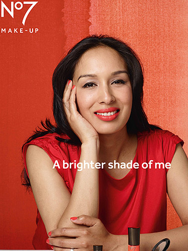
Boots No7 No retouching/airbrushing campaign 2013.
https://s-media-cache-ak0.pinimg.com/236x/18/70/02/187002b2743afd76d48fd649660ff84b.jpg
The No7 beauty ad above is one of my favourite ads I have found whilst analysing their advertisements. This beauty ad is also part of their no retouching campaign images and I think the model looks gorgeous, confident and powerful in this image. I love the pose the model is sitting in, she looks relaxed yet she is also wearing/showing off a smart tailored blazer it appears, the blazer has satin material on it which adds a sensual and demure theme to the image. The black satin compliments the bright shades of red featured on the models lips, nails and back drop behind her, these shades of red tie together without overpowering the image. The slogan and choice of clothing in this beauty ad both make me take the woman seriously, she is presented to look confident, relaxed in her own skin and also powerful. This image has inspired me a look when considering poses and themes I wanted to create in my final brand images, as the model appears serious but still beautiful,similarly to microscopic diseases are pretty to look at but underlying the diseases is a very dark,macabre theme and background to them as they are deadly and harmful diseases.

Boots No7 No retouching/airbrushing campaign 2013.
http://i.dailymail.co.uk/i/pix/2015/08/05/10/2B1D28C400000578-3185794-image-m-13_1438767190805.jpg
'After being part of this campaign I feel like I could wear gorgeous orange makeup, even if I’m feeling laid back, which is not a feeling I would have put with the colour before.
'It’s so exciting to feel more adventurous with colour and know that I have a fresh new look to play with!'. - Rachel Hylton, Special Needs Teacher from East London.
Although the quote above is a little contradictory when we No7 have claimed they feel women use and wear make-up in order to express their feelings through colour, Rachel Hylton expresses that wearing an orange shade in the campaign made her feel empowered in a way where she felt she could wear and experiment with different colors despite of what mood she may be in, which I love a lot since I am usually nervous about wearing colour of my lips myself a lot because people assume its to hide or wear a certain colour for a certain reason, thats why No7's no retouching campaign is important as it embraces and promotes confidence.
Keeley Hawes.
https://s3-eu-west-1.amazonaws.com/mother-londen-production-s3bucket-asda8lo6v37l/content/section-5412be978e1213.44655386/Carousel/NO7_EXT_2009%20copy.jpg
This beauty ad and the one below I think are no7 beauty ads from 2011, featuring the British actress and former model Keeley Hawkes. In 2011 Keeley Hawkes became No7's new beauty model and spokesperson, featuring in numerous advertisements and commercials. Compared to No7's most recent no retouching campaign, these advertisements appear to be much more perfected and edited. The company apparently chose Keeley Hawkes to promote their spring collection as they were looking for someone friendly and fresh with an 'intelligent confidence', which Hawkes fit perfectly. I feel No7 beauty campaigns in 2011 aimed to promote their anti ageing products more instead of aiming to sell to a younger audience as well starting from 25, the pose in the image appears very forced and staged, making Keeley Hawkes appear photoshopped and awkward but nevertheless still beautiful and very youthful and she has no wrinkles, lines and unbalanced skin in this ad.
References
http://www.sofeminine.co.uk/make-up/no7-say-no-to-airbrushing-for-new-beauty-campaign-s93306.html
http://www.nilakkurt.com/?p=864
http://www.sofeminine.co.uk/make-up/no7-say-no-to-airbrushing-for-new-beauty-campaign-s93306.html
https://s3-eu-west-1.amazonaws.com/mother-londen-production-s3bucket-asda8lo6v37l/content/section-
http://i.dailymail.co.uk/i/pix/2015/08/05/10/2B1D28C400000578-3185794-image-m-13_1438767190805.jpg
http://i.dailymail.co.uk/i/pix/2015/08/05/10/2B1D28CF00000578-3185794-image-a-11_1438767014812.jpg


